

Appearance
XY Chart
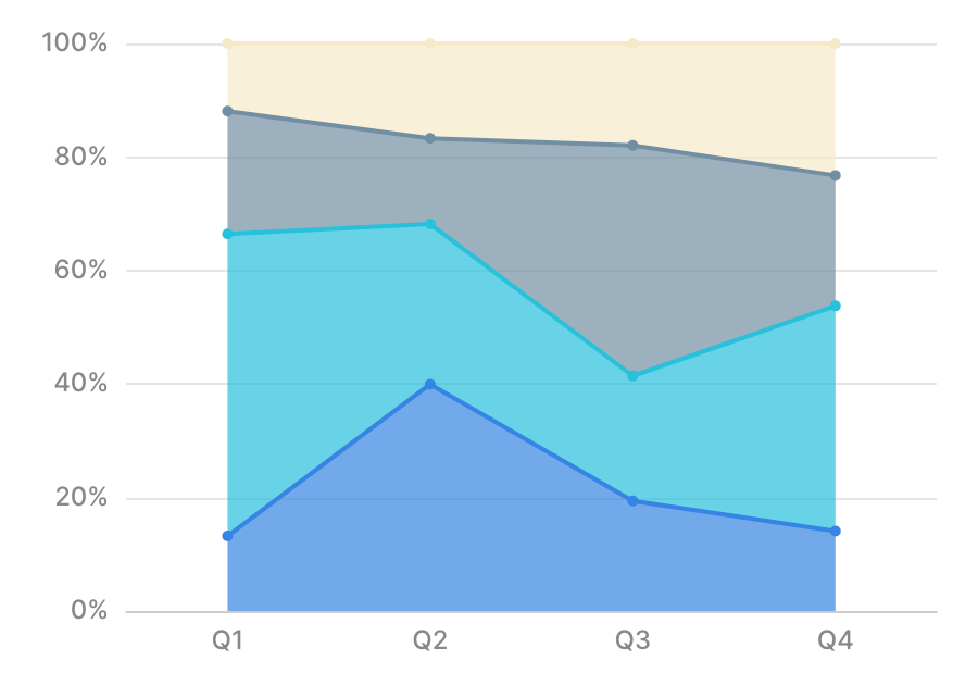
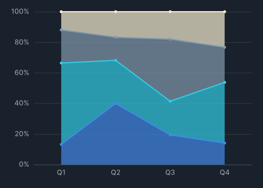
XY Chart aggregates a Y value (metric) against an X value (dimension) and displays the result. You can draw line, bar, area, scatter, and other types individually or as a combination, and use group by or series to handle multiple series.
Drawing types
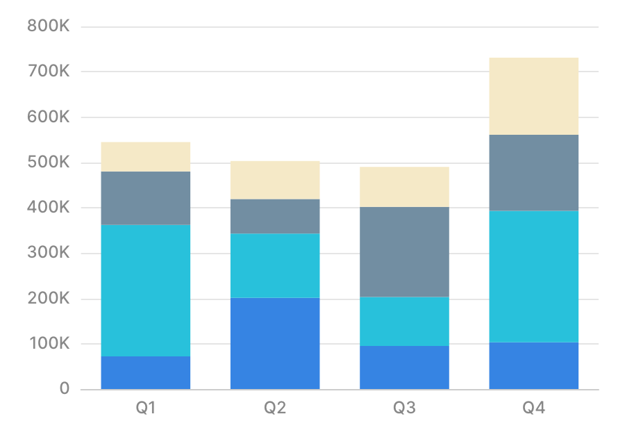
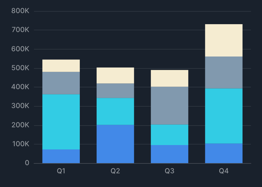
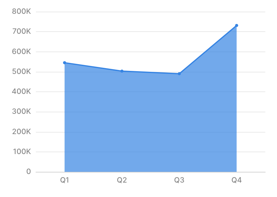
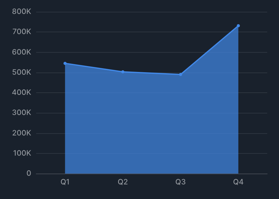
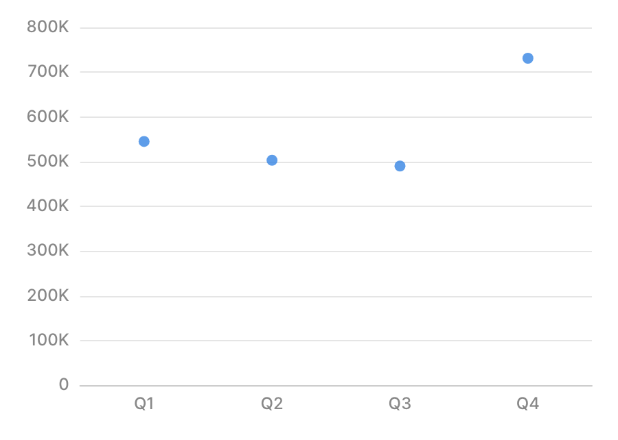
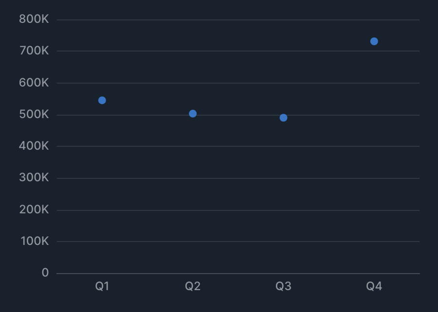
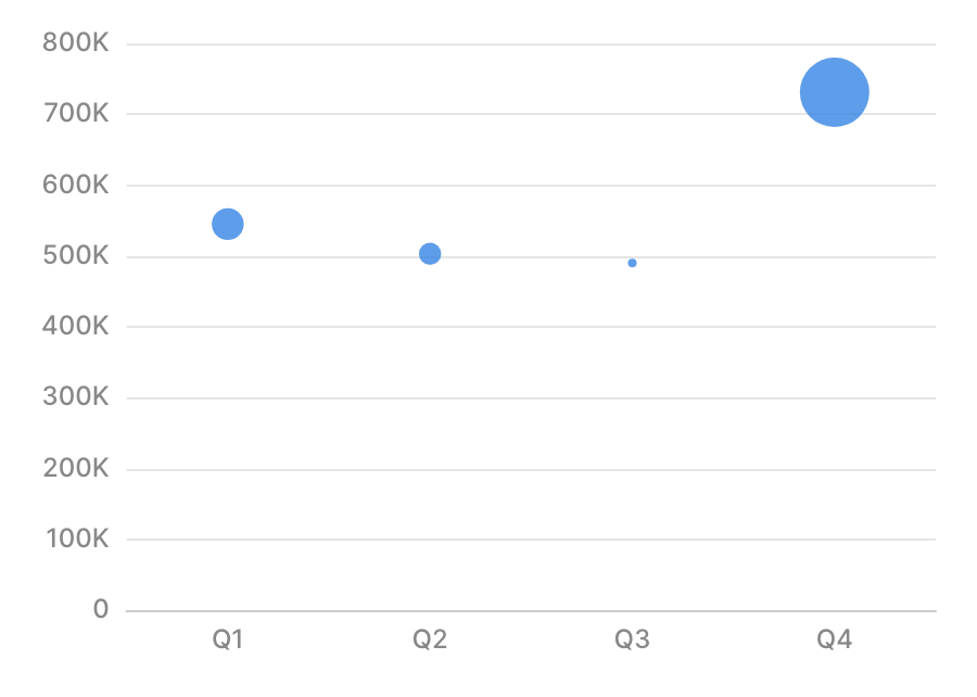
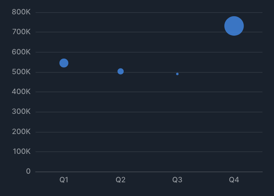
XY Chart supports the following drawing types, as well as combined charts that mix them.
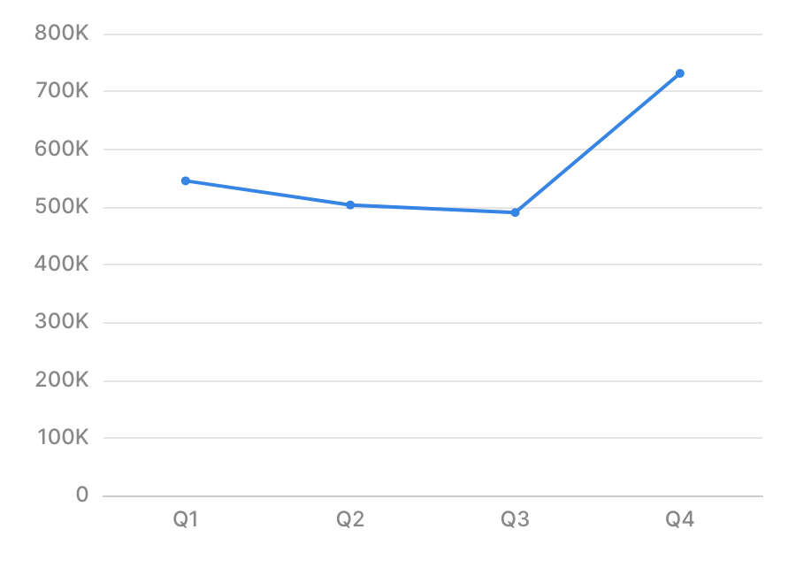
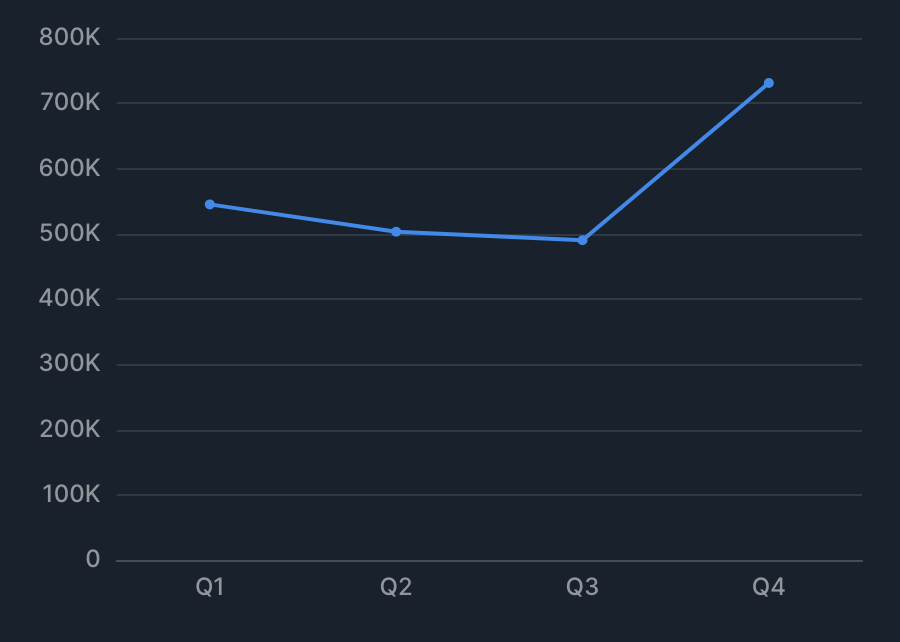
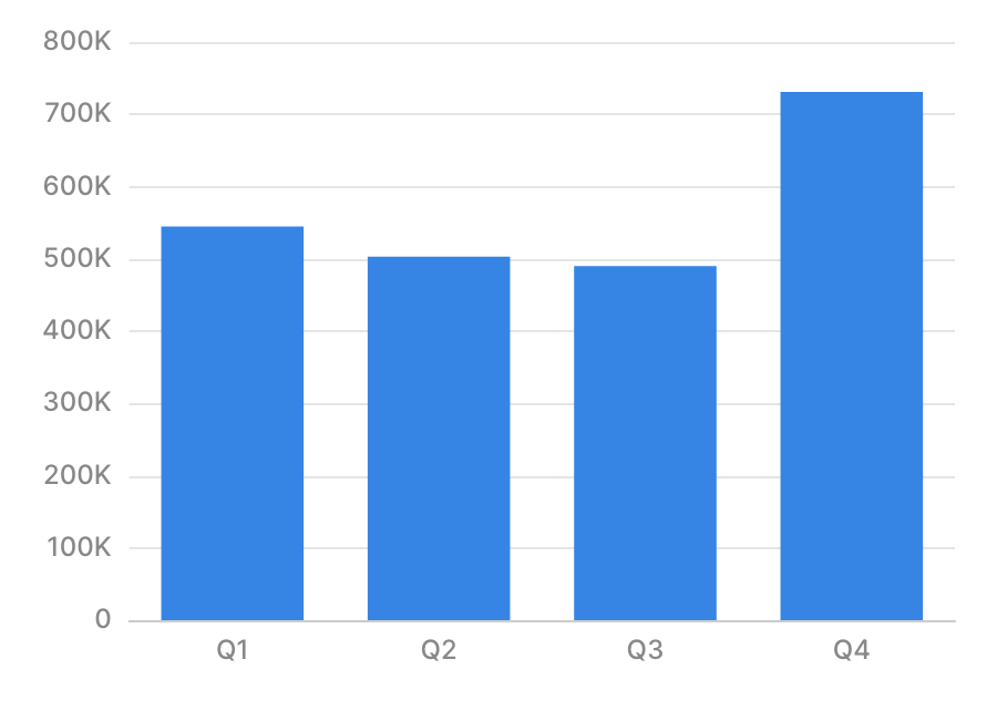
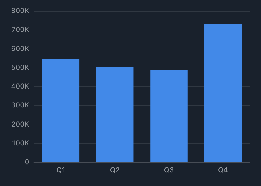
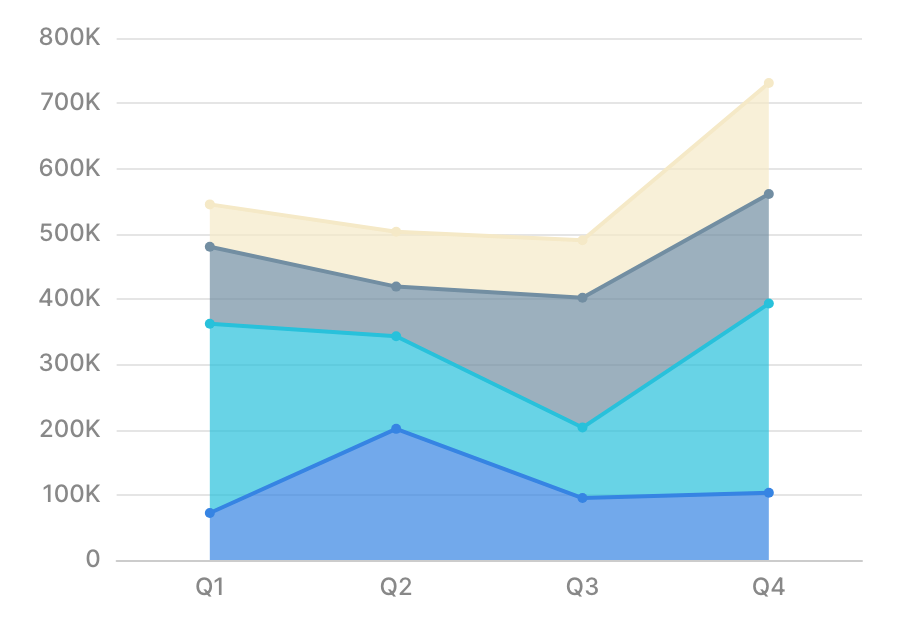
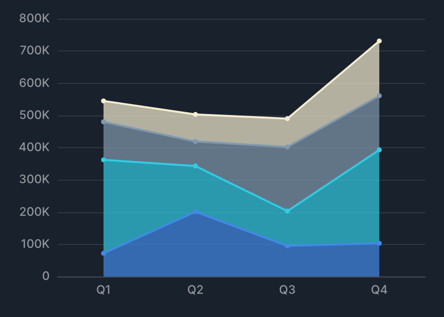
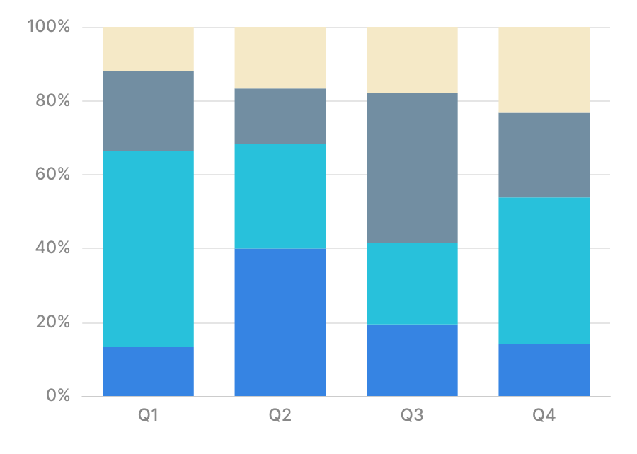
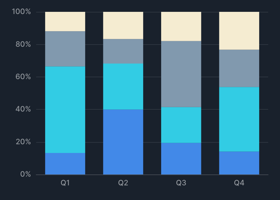
Specification
Aggregation
XY Chart treats X value as a dimension and Y value as a metric, aggregating Y for each X and drawing it as a series. See Dimensions and metrics for the concepts behind dimensions and metrics. The difference from XYZ Chart is that there, both the X value and Y value are dimensions, and the Z value is aggregated for each combination of X and Y.
| Item | Role | Notes |
|---|---|---|
| X value | Dimension | The unit of aggregation (aggregated per X). |
| Y value | Metric | Specified per series. Each metric adds a series. |
| Group by | Dimension | Splits the series by the value of the specified column. |
| Bubble size | Metric | Specified only when drawing bubbles. |
Examples
- Show "total sales by month" as a line chart.
- X value: month.
- Y value: sum of sales.
- Show "total sales by product category" as a bar chart.
- X value: product category.
- Y value: sum of sales.
X-axis specification
In XY Chart, the type of X axis is determined by the X-axis data type and the combination of drawing types.
| X-axis data type | Drawing type combination | X-axis classification |
|---|---|---|
| Date/datetime | Any | Time axis |
| Numeric | Scatter, bubble, or line only | Numeric axis |
| Numeric | Includes bar, area, or stacked | Category axis |
| Anything else | Any | Category axis |
Category axis
On a category axis, even if the specified values are numeric or date/datetime, they're drawn as discrete values at equal intervals.
Specifying axis min/max
When you specify a min or max on a category axis, the specified value is treated as the index of the data's display order (0th, 1st, 2nd, and so on).
| Index | X-axis value |
|---|---|
| 0th | 1 |
| 1st | 10 |
| 2nd | 20 |
| 3rd | 30 |
| ... | ... |
| 10th | 100 |
In this case, setting the axis max to 10 shows data up to the 10th item, so the X axis is shown up to the value 100.
Time axis
On a time axis, the specified date/datetime data is drawn as a continuous time series.
- Axis labels are determined dynamically based on the specified date/datetime data.
- If the data includes a timezone, it's converted to the browser's timezone for drawing.
- Because axis labels are shown based on the browser's timezone, if the browser's timezone doesn't match the data's timezone, the axis labels and data labels might not line up.
- Using a datetime type without a timezone avoids the effect of the browser's timezone.
Numeric axis
On a numeric axis, the specified numeric data is drawn as continuous numeric values.
Tips
Specifying multiple series
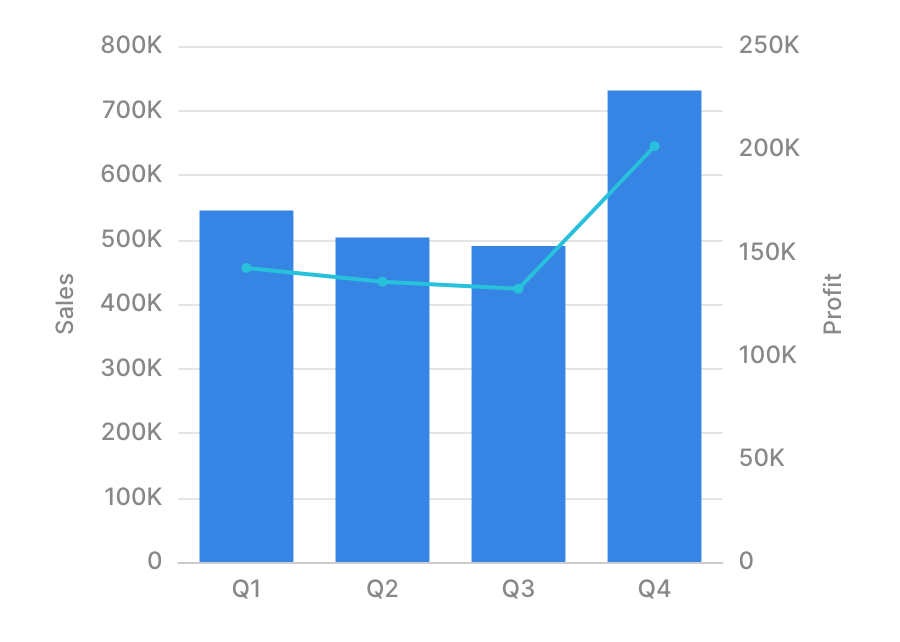
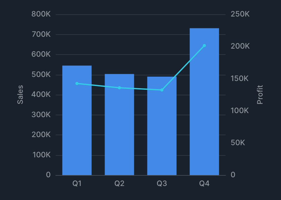
When you set multiple series, Indepedent scale appears within each series' settings. Turning this on makes that series' Y-axis scale independent, drawn on the right side.
You can configure labels and other settings for the independent Y axis in advanced settings > Independent axes.
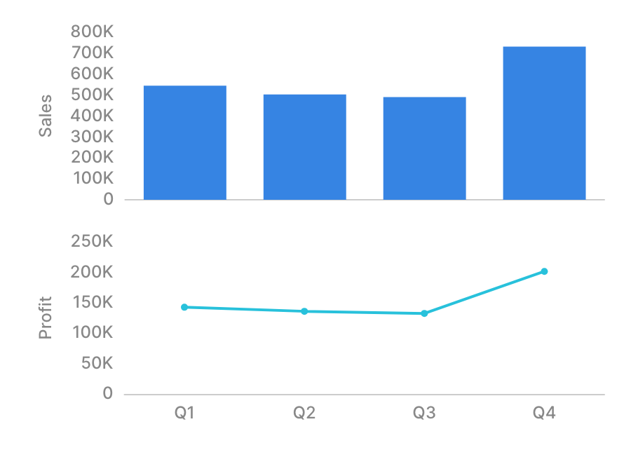
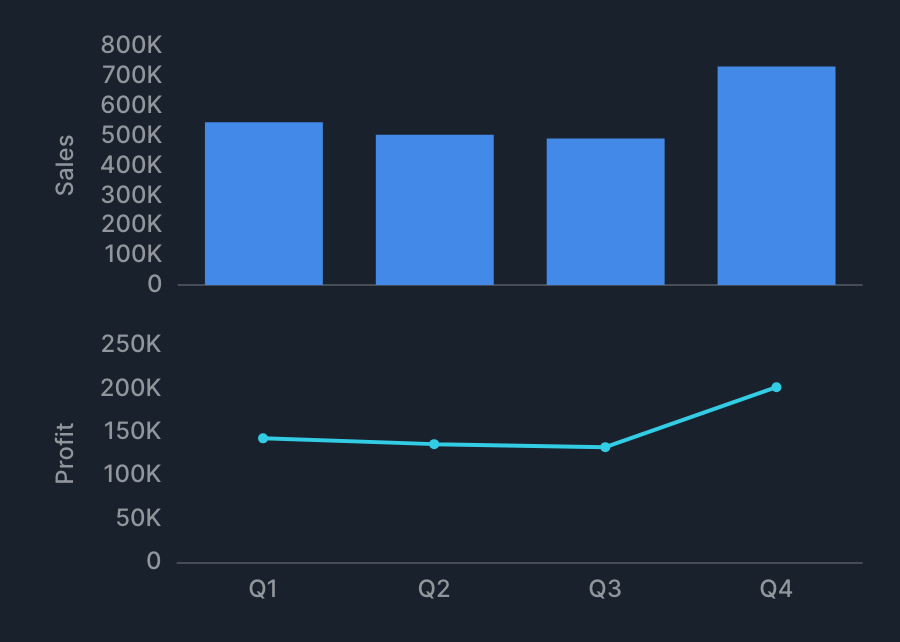
When you set multiple series, Split by series appears below the Series setting. Turning this on makes each series' Y-axis scale independent and arranges the series vertically.
Enabling Split by series disables the frame feature. It also hides the Indepedent scale setting above, since all series are then treated as independent axes. You can configure the Y axis for each series in advanced settings > Independent axes.
Frame
XY Chart supports the frame feature. See Frame for details.
Reference lines, trends, and statistics
See Reference lines, trends, and statistics for details.