

Appearance
Radial Chart
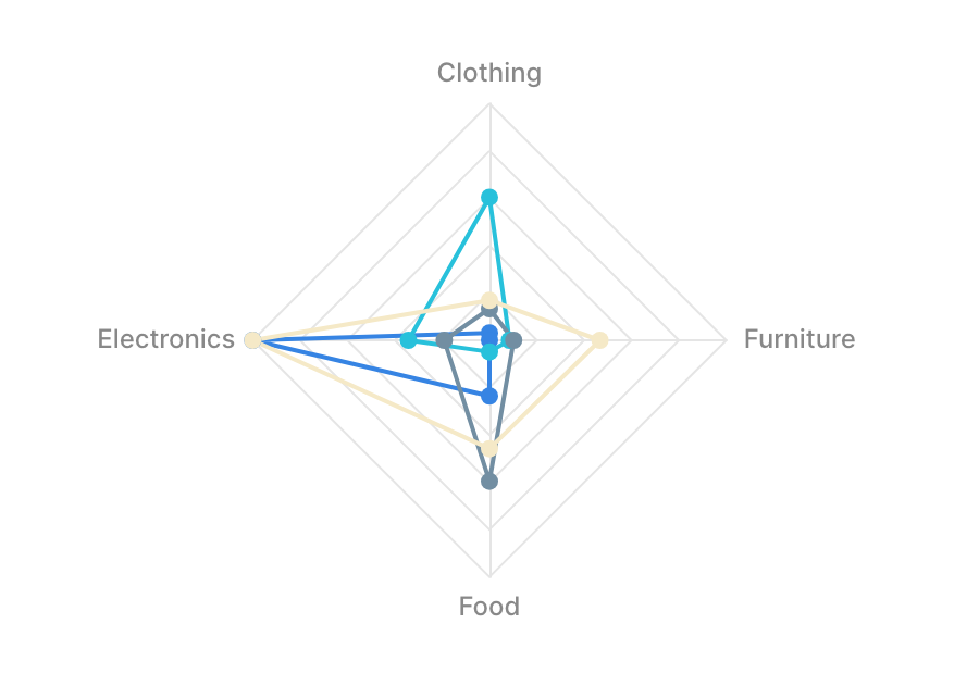
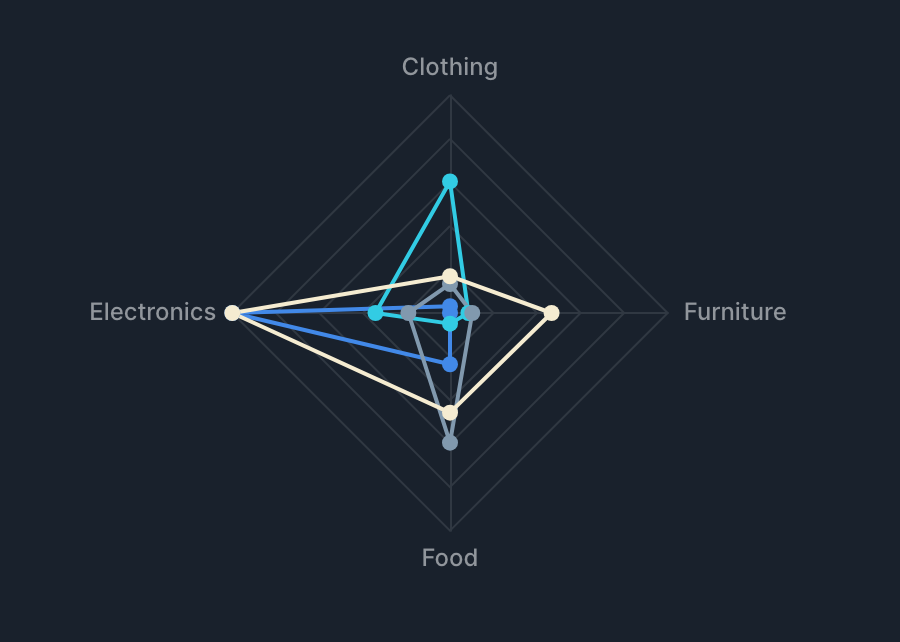
Radial Chart visualizes composition ratios or comparisons between items. It aggregates a value (metric) for each label (dimension). In a radar chart, you can use group by to overlay multiple series for comparison.
Drawing types
Radial Chart supports the following drawing types.
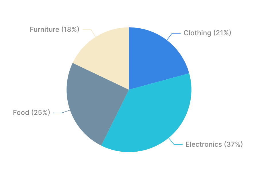
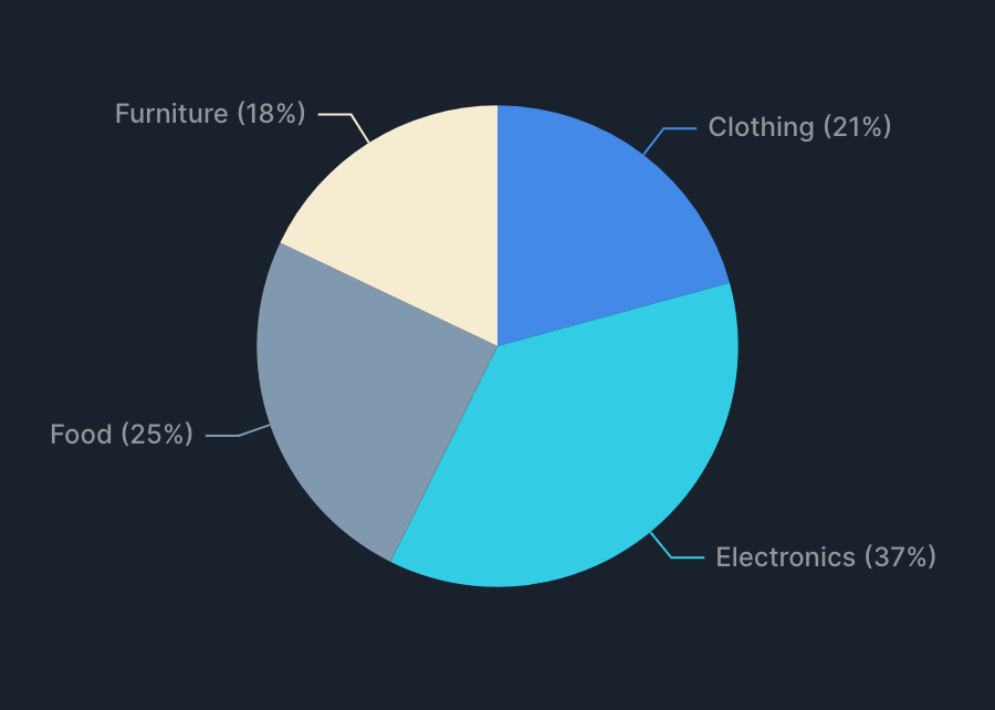
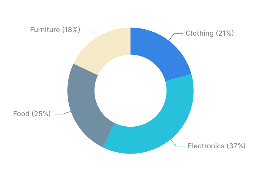
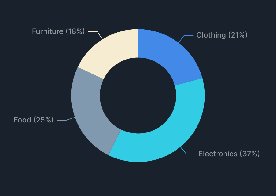
Specification
Aggregation
Radial Chart aggregates a value (metric) for each label (dimension) and displays the result.
| Item | Role | Notes |
|---|---|---|
| Label | Dimension | Becomes the item name (segment). |
| Value | Metric | Aggregated for each label. |
| Group by | Dimension | Splits the series by value (radar chart only). |
Examples
- Show "total sales by product category" as a pie chart.
- Label: product category.
- Value: sum of sales.
- Compare "customer satisfaction by evaluation item, broken down by department" as a radar chart.
- Label: evaluation item.
- Value: average customer satisfaction.
- Group by: department.
Specification by drawing type
- Pie and donut charts are drawn as a single series of "label × value".
- Radar charts use labels as axes, with the series split by the value of group by.
Tips
Frame
Radial Chart supports the frame feature. See Frame for details.