

Appearance
Reference lines, trends, and statistics
On XY Chart and XYZ Chart, you can add the following displays from advanced settings. The setting items (type, display, trend type, and so on) are common to both.
| Feature | Content |
|---|---|
| Reference line | Shows a guide line or band on an axis. |
| Trend | Shows the tendency of a series using regression or a moving average. |
| Statistics | Shows a series' average, median, max, and min as dashed lines. |
There are differences in where you open the settings.
| Item | XY Chart | XYZ Chart |
|---|---|---|
| Reference line | Advanced settings > X axis / Y axis > Reference line | Same. Scatter and bubble only (hidden for heatmap). |
| Trend / statistics | Advanced settings > Series > (each Y value's series) > Trend / Statistics | Advanced settings > Series > Trend / Statistics. Scatter and bubble only (hidden for heatmap). |
Reference line
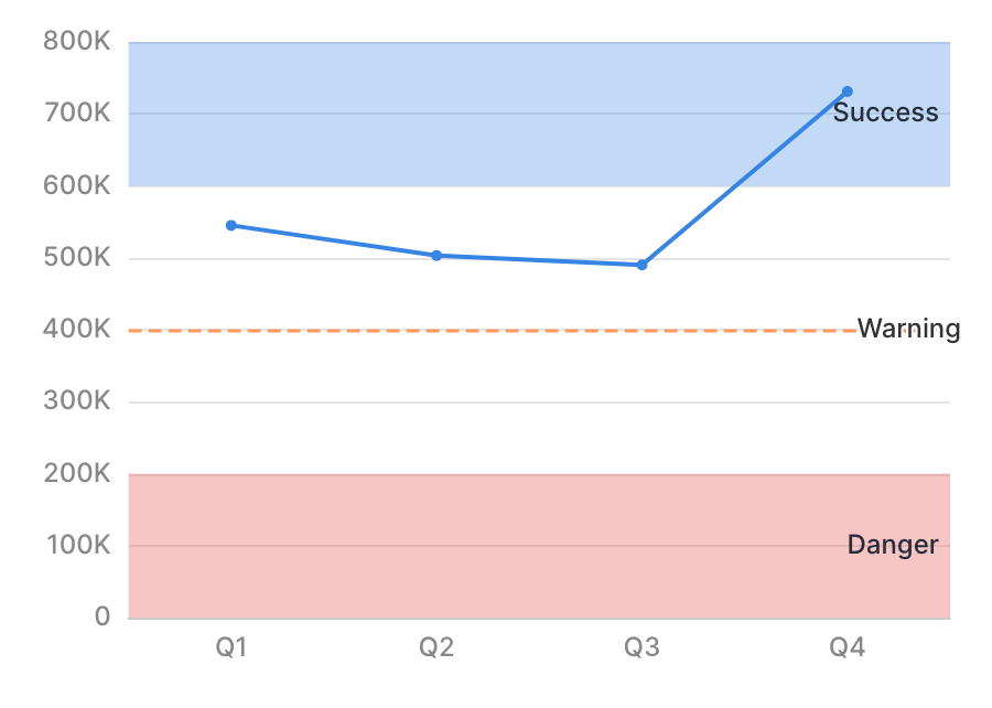
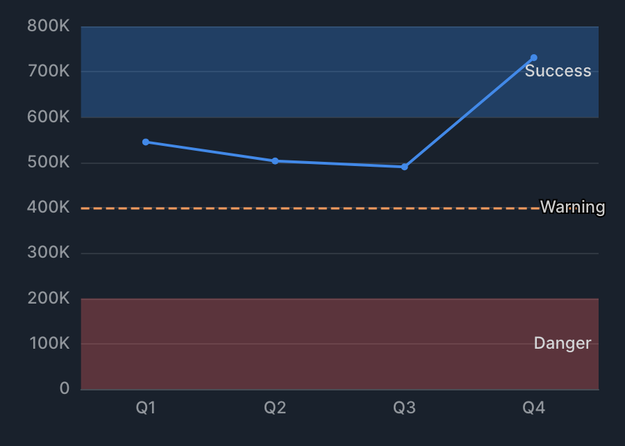
You can show a guide line or area on a chart, such as a target value, an acceptable range, or a danger zone. Y-axis reference lines are drawn horizontally, and X-axis reference lines are drawn vertically.
How to configure
- In the chart edit screen's advanced settings, open the axis (X axis / Y axis) where you want to show a reference line.
- Add an item under Reference line.
- Specify the type and value.
On XYZ Chart, you can only configure reference line for scatter and bubble.
Specification
| Item | Description |
|---|---|
| Type: Line | Shows a dashed line at a specific value. Specify the position with Value (for example, a sales target, a threshold, or a marker for a specific date). |
| Type: Band (range) | Shows a specific range as a semi-transparent band. Specify the range with Start value / End value. Leaving these blank extends the band to the edge of the chart (for example, an acceptable range, a danger zone, or a caution period). |
| Color | Choose from Success / Warning / Danger. |
| Label | The text attached to the reference line. |
Trend
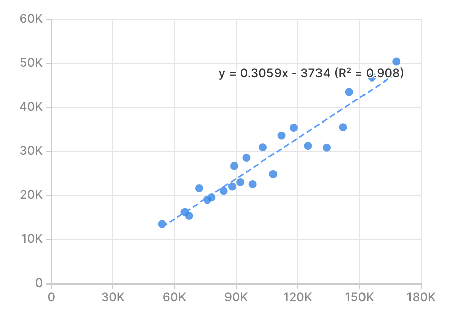
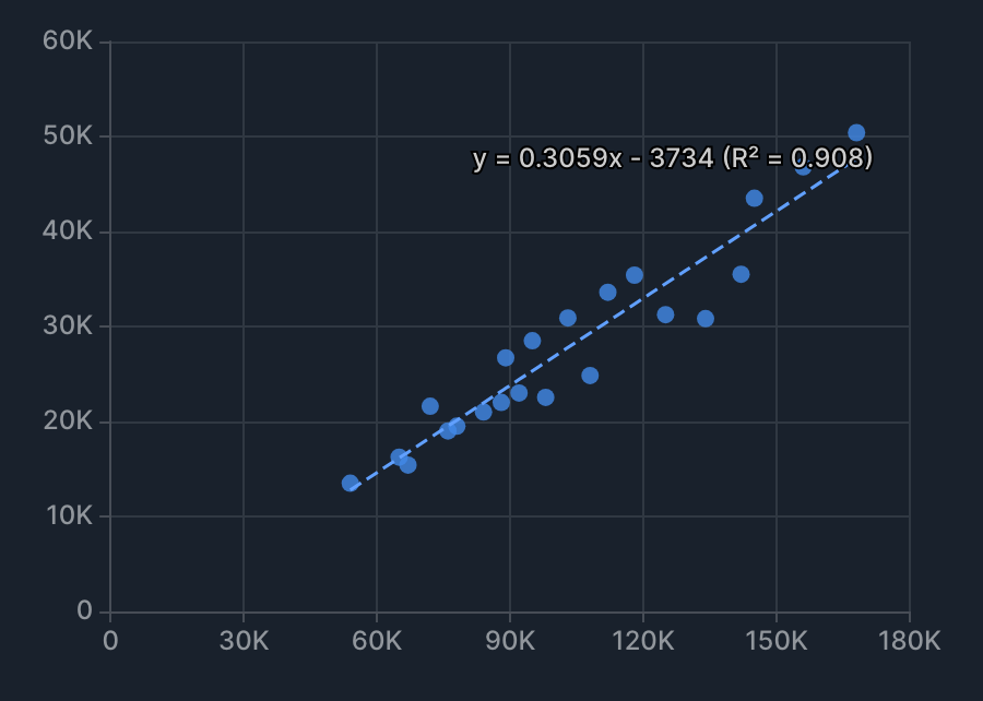
You can show a trend line (regression, moving average, and so on) for a series. The trend line is added as a separate series from the original.
How to configure
- In the chart edit screen, open advanced settings > Series.
- On XY Chart, open the target Y value (series) first, then configure it.
- On XYZ Chart, configure it directly under Series (scatter and bubble only).
- Turn on Trend > Display.
- Choose a trend type.
The trend line is shown as a dashed line. Except for Moving average, the equation and R² (coefficient of determination) are shown on the chart. You can hide them with Hide equation / Hide R².
Trend types
| Trend type | Description | Additional setting |
|---|---|---|
| Linear | Shows a linear regression (y = mx + c). | None. |
| Polynomial | Shows a polynomial regression. | Polynomial degree (2–5). |
| Moving average | Shows a moving average. | Moving average window size. |
| Exponential | Shows an exponential regression (y = ae^(bx)). | None. |
| Logarithmic | Shows a logarithmic regression (y = a + b ln(x)). | None. |
| Power | Shows a power regression (y = ax^b). | None. |
If there's too little data, or the specified trend type fails to fit, the trend line isn't shown.
Statistics
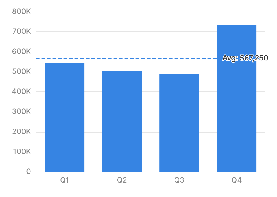
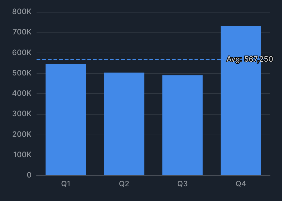
You can show a series' statistical value as a dashed line. The dashed line's label shows the statistic type and its value.
How to configure
- In the chart edit screen, open advanced settings > Series.
- On XY Chart, open the target Y value (series) first, then configure it.
- On XYZ Chart, configure it directly under Series (scatter and bubble only).
- Turn on Statistics > Display.
- Choose a statistic type (Average / Median / Max / Min).
Difference from trend
| Characteristic | Statistics | Trend |
|---|---|---|
| Display format | Shown as part of the same series. | Added as a separate series (trend line). |
| When zooming the chart | Recalculated using only the data in the visible range. | Not recalculated (always based on all data). |
| Display on stacked charts | Shown in sync with the target series' stacking. | Not stacked; shown as a separate series. |